
http://www.codeproject.com/Articles/124644/Basic-Understanding-of-Tree-View-in-WPF
Basic Understanding of Tree View in WPF

| (66 votes) |

Introduction
This article describes the use of TreeView control provided by WPF. It will give you a knowledge to create simple Tree, customization, Template and Binding. It mainly focuses on how to show contents in the tree view. This article will help you to understand the basics of tree view and also gives you deep knowledge to show content on tree according to your requirement.
I had to use tree view in one of my projects where I had to show image and text as most of tree has in windows. This problem started my journey to learn features provided by WPF. At the start of my journey, I found many difficulties and sometimes I said Windows application contains more user friendly controls to work with, but with the passage of time I found WPF controls more user friendly.
This article will cover the following 6 main areas:
- Create Simple Tree
- Create Customize Tree
- Create Tree using Header Template
- Create Tree Using Object
- Create Tree using Data Binding
- Create Tree by data type of object
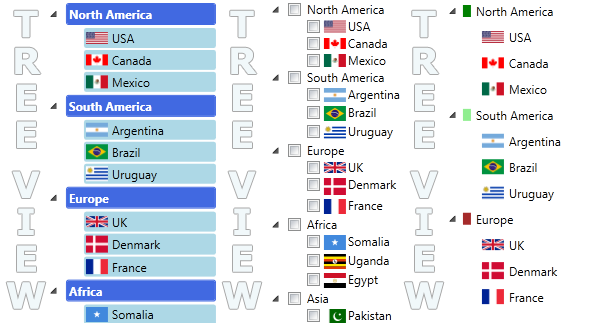
Create Simple Tree
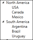
If you want to create a simple tree then WPF provides you an easy way draw tree. Just add TreeView control on your page and add items in either using XAML or from code behind.
Using XAML
You can easily create a tree using XAML.
 <TreeView>
    <TreeViewItem Header="North America">
        <TreeViewItem Header="USA"></TreeViewItem>
        <TreeViewItem Header="Canada"></TreeViewItem>
        <TreeViewItem Header="Mexico"></TreeViewItem>
    </TreeViewItem>
    <TreeViewItem Header="South America">
        <TreeViewItem Header="Argentina"></TreeViewItem>
        <TreeViewItem Header="Brazil"></TreeViewItem>
        <TreeViewItem Header="Uruguay"></TreeViewItem>
    </TreeViewItem>
 </TreeView>
Using code
If you want to populate tree from code behind, then simply place your tree on form and add tree item according to your tree hierarchy.
 <TreeView Name="tvMain">
</TreeView> TreeViewItem treeItem = null;
// North America
treeItem = new TreeViewItem();
treeItem.Header = "North America";
treeItem.Items.Add(new TreeViewItem() { Header = "USA" });
treeItem.Items.Add(new TreeViewItem() { Header = "Canada" });
treeItem.Items.Add(new TreeViewItem() { Header = "Mexico" });
tvMain.Items.Add(treeItem);Customize Tree

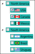
If you want to add some other controls with the content e.g. checkbox, image, etc., then you can easily design your tree without any big effort. You just need to customize the HeaderTemplate of the TreeViewItem. You can also create class derived from TreeViewItem and change its Header according to your requirement.
Using XAML
For customizing the Tree item, simply change item’s Header.
 <TreeView >
    <TreeViewItem >
        <TreeViewItem.Header>
            <StackPanel Orientation="Horizontal">
                <Border Background="Green" Width="8" Height="12"
                        BorderBrush="#00000000"></Border>
                <Label Content="North America"></Label>
            </StackPanel>
        </TreeViewItem.Header>

        <!-- Child Item -->

        <TreeViewItem>
            <TreeViewItem.Header>
                <StackPanel Orientation="Horizontal">
                    <Image Source="../Images/usa.png"></Image>
                    <Label Content="USA"></Label>
                </StackPanel>
            </TreeViewItem.Header>
        </TreeViewItem>
    </TreeViewItem>
 </TreeView>
Using Code
If you want to create header from code behind, then WPF will not disappoint you. You can change header template very smartly.
 private TreeViewItem GetTreeView(string text, string imagePath)
 {
    TreeViewItem item = new TreeViewItem();

    item.IsExpanded = true;

    // create stack panel
    StackPanel stack = new StackPanel();
    stack.Orientation = Orientation.Horizontal;

    // create Image
    Image image = new Image();
    image.Source = new BitmapImage
		(new Uri("pack://application:,,/Images/" + imagePath));

    // Label
    Label lbl = new Label();
    lbl.Content = text;


    // Add into stack
    stack.Children.Add(image);
    stack.Children.Add(lbl);

    // assign stack to header
    item.Header = stack;
    return item;
 }
Using overriding TreeViewItem
You can also customize TreeViewItem by writing a new derived class for custom item. It is also pretty easy. Just create header template and assign it to Header property if TreeViewItem.
 public class ImageTreeViewItem : TreeViewItem
 {
    #region Data Member

    Uri _imageUrl = null;
    Image _image = null;
    TextBlock _textBlock = null;

    #endregion

    #region Properties

    public Uri ImageUrl
    {
        get { return _imageUrl; }
        set
        {
            _imageUrl = value;
            _image.Source = new BitmapImage(value);
        }
    }

    public string Text
    {
        get { return _textBlock.Text; }
        set { _textBlock.Text = value; }
    }

    #endregion

    #region Constructor

    public ImageTreeViewItem()
    {
        CreateTreeViewItemTemplate();
    }

    #endregion

    #region Private Methods

    private void CreateTreeViewItemTemplate()
    {
        StackPanel stack = new StackPanel();
        stack.Orientation = Orientation.Horizontal;

        _image = new Image();
        _image.HorizontalAlignment = System.Windows.HorizontalAlignment.Left;
        _image.VerticalAlignment = System.Windows.VerticalAlignment.Center;
        _image.Width = 16;
        _image.Height = 16;
        _image.Margin = new Thickness(2);

        stack.Children.Add(_image);

        _textBlock = new TextBlock();
        _textBlock.Margin = new Thickness(2);
        _textBlock.VerticalAlignment = System.Windows.VerticalAlignment.Center;

        stack.Children.Add(_textBlock);

        Header = stack;
    }

    #endregion
 }
Header Template

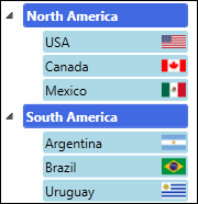
If the style of all the elements is the same, then it is better to create header template at once. Because the problem with the last example was for the same design, we add template for each tree item.
Using XAML
For creating general TreeViewItem item template, create Template resource at application level, window level or at control level resource. In this example, I have created resource at control level and set theTargetType=”TreeViewItem” and also set the “HeaderTemplate” property of the TreeViewItem.
 <TreeView Name="tvMain">
    <TreeView.Resources>
        <Style TargetType="{x:Type TreeViewItem}">
            <Setter Property="HeaderTemplate">
                <Setter.Value>
                    <DataTemplate>
                        <StackPanel Orientation="Horizontal">
                            <CheckBox Name="chk" Margin="2" Tag="{Binding}" >
			</CheckBox>
                            <Image  Margin="2"  Source="{Binding Converter=
			{StaticResource CustomImagePathConvertor}}"></Image>
                            <TextBlock Text="{Binding}"></TextBlock>
                        </StackPanel>
                    </DataTemplate>
                </Setter.Value>
            </Setter>
        </Style>
    </TreeView.Resources>

    <TreeViewItem Header="North America" IsExpanded="True">
        <TreeViewItem Header="USA"></TreeViewItem>
        <TreeViewItem Header="Canada"></TreeViewItem>
        <TreeViewItem Header="Mexico"></TreeViewItem>
    </TreeViewItem>

    <TreeViewItem Header="South America"  IsExpanded="True">
        <TreeViewItem Header="Argentina"></TreeViewItem>
        <TreeViewItem Header="Brazil"></TreeViewItem>
        <TreeViewItem Header="Uruguay"></TreeViewItem>
 </TreeView>
It is a very interested point here that I did not pass Image path for each country, but TreeView shows flag with each country. I achieved by writing custom converter CustomImagePathConverter.
  <Image  Margin="2"  Source="{Binding Converter=
	{StaticResource CustomImagePathConverter}}"></Image>
Implement CustomImagePathConverter from IValueConverter. You can associate a value converter with binding. In this example, I am getting image path from the country name, as you can see in code.
 public class CustomImagePathConverter : IValueConverter
 {
    #region IValueConverter Members

    public object Convert(object value, Type targetType, object parameter,
                                    System.Globalization.CultureInfo culture)
    {
        return "../Images/" + GetImageName(value.ToString());
    }

    public object ConvertBack(object value, Type targetType, object parameter,
                                    System.Globalization.CultureInfo culture)
    {
        return "";
    }

    #endregion

    private string GetImageName(string text)
    {
        string name = "";
        name = text.ToLower() + ".png";
        return name;
    }
 }
Using Code
You can easily create template from code behind. FrameworkElementFactory provides you a facility to create templates. Let's see how can we achieve this exciting feature.
 private DataTemplate GetHeaderTemplate()
 {
    //create the data template
    DataTemplate dataTemplate = new DataTemplate();

    //create stack pane;
    FrameworkElementFactory stackPanel = new FrameworkElementFactory(typeof(StackPanel));
    stackPanel.Name = "parentStackpanel";
    stackPanel.SetValue(StackPanel.OrientationProperty, Orientation.Horizontal);

    // Create check box
    FrameworkElementFactory checkBox = new FrameworkElementFactory(typeof(CheckBox));
    checkBox.Name = "chk";
    checkBox.SetValue(CheckBox.NameProperty, "chk");
    checkBox.SetValue(CheckBox.TagProperty , new Binding());
    checkBox.SetValue(CheckBox.MarginProperty, new Thickness(2));
    stackPanel.AppendChild(checkBox);

    // Create Image
    FrameworkElementFactory image = new FrameworkElementFactory(typeof(Image));
    image.SetValue(Image.MarginProperty, new Thickness(2));
    image.SetBinding(Image.SourceProperty, new Binding()
		{ Converter = new CustomImagePathConverter() });
    stackPanel.AppendChild(image);

    // create text
    FrameworkElementFactory label = new FrameworkElementFactory(typeof(TextBlock));
    label.SetBinding(TextBlock.TextProperty, new Binding());
    label.SetValue(TextBlock.ToolTipProperty, new Binding());
    stackPanel.AppendChild(label);


    //set the visual tree of the data template
    dataTemplate.VisualTree = stackPanel;

    return dataTemplate;
 }
Simply assign this template to HeaderTemplate of each TreeViewitem.
 DataTemplate template = GetHeaderTemplate();

 foreach (WorldArea area in WorldArea.GetAll())
 {
    TreeViewItem item = new TreeViewItem();
    item.HeaderTemplate = template;
    item.Header = area.Name;

    .
    .
    .
    .
 }
Get selected checked items
You can easily get the child items from the template. Just for the example, I am showing you how to get the selected check boxes from the tree view. WPF manage control in hierarchical structure, you can access any child usingVisualTreeHelper class.
 private List<CheckBox> GetSelectedCheckBoxes(ItemCollection items)
 {
    List<CheckBox> list = new List<CheckBox>();
    foreach (TreeViewItem item in items)
    {
        UIElement elemnt = GetChildControl(item, "chk");
        if (elemnt != null)
        {
            CheckBox chk = (CheckBox)elemnt;
            if (chk.IsChecked.HasValue && chk.IsChecked.Value)
            {
                list.Add(chk);
            }
        }

        List<CheckBox> l = GetSelectedCheckBoxes(item.Items);
        list = list.Concat(l).ToList();
    }

    return list;
 }

 private UIElement GetChildControl(DependencyObject parentObject, string childName)
 {

    UIElement element = null;

    if (parentObject != null)
    {
        int totalChild = VisualTreeHelper.GetChildrenCount(parentObject);
        for (int i = 0; i < totalChild; i++)
        {
            DependencyObject childObject = VisualTreeHelper.GetChild(parentObject, i);

            if (childObject is FrameworkElement &&
		((FrameworkElement)childObject).Name == childName)
            {
                element = childObject as UIElement;
                break;
            }

            // get its child
            element = GetChildControl(childObject, childName);
            if (element != null) break;
        }
    }

    return element;
 }
Custom Objects
WPF provides you many ways to populate tree. You can directly add your object as a TreeViewItem in the tree and WPF gives respect to your objects and display it as you want. You just need to tell him which field will be shown in item.
Using XAML
For populating custom object in tree, you just need to create template for your object. I usedHierarchicalDataTemplate for designing template.
 <TreeView Name="tvMain">
    <TreeView.ItemTemplate>
        <HierarchicalDataTemplate ItemsSource="{Binding Path=Countries}">
            <StackPanel Orientation="Horizontal" Margin="4" Background="LightSeaGreen">
                <CheckBox Name="chk" Margin="2" Tag="{Binding Path=Name}" ></CheckBox>
                <Image  Margin="2" Source="{Binding Path=ImageUrl}" ></Image>
                <TextBlock Text="{Binding Path=Name}" Margin="2" >
                </TextBlock>
                <StackPanel.Effect>
                    <DropShadowEffect BlurRadius="2" Color="LightGray"
			 Opacity=".2" ></DropShadowEffect>
                </StackPanel.Effect>
            </StackPanel>
        </HierarchicalDataTemplate>
    </TreeView.ItemTemplate>
 </TreeView>
After creating template, you just need to add custom object from your code behind file, as you can see code below. I am just putting parent object in the tree. But when you will run this code, you will also see child countries are also being shown. The reason is that because I have define template in XAML for child items using ItemsSource="{Binding Path=Countries}".
 private void FillTree()
 {
    foreach (WorldArea area in WorldArea.GetAll())
    {
        tvMain.Items.Add(area);
    }
 }
Using Code
You can also create template for your object from code behind file, as we created in previous example. The tricky part here, how can we add custom objects in the hierarchical way? Because using XAML we can write create hierarchical template. We can also create hierarchical template using code behind, but in this example I am not doing that, I am achieving the solution from other way. This technique will give you a new way to work and you can implement it in other Items controls like ListView, ListBox etc. But in the last example, I will create hierarchical template from code behind.
 private void FillTree()
 {
    tvMain.ItemTemplate = GetHeaderTemplate();
    tvMain.ItemContainerGenerator.StatusChanged +=
		new EventHandler(ItemContainerGenerator_StatusChanged);

    foreach (WorldArea area in _list)
    {
        tvMain.Items.Add(area);
    }
 }

 void ItemContainerGenerator_StatusChanged(object sender, EventArgs e)
 {
    if (tvMain.ItemContainerGenerator.Status == GeneratorStatus.ContainersGenerated)
    {
        foreach (WorldArea area in _list)
        {
            TreeViewItem item =
		(TreeViewItem)tvMain.ItemContainerGenerator.ContainerFromItem(area);
            if (item == null) continue;
            item.IsExpanded = true;
            if (item.Items.Count == 0)
            {

                foreach (Country country in area.Countries)
                {
                    item.Items .Add(country);
                }
            }
        }
    }
 }
As you can see in code after adding setting template, I have registeredtvMain.ItemContainerGenerator.StatusChanged event. ItemContainerGenerator generates the containers for each custom object. When we add custom object in the TreeView ItemContainerGenerator starts to generate container in separate thread. So we cannot get container in the next line after adding object. So you need to registerStatusChanged event, which fires after the status change and you can get container after that.
Data Binding

You can also bind your tree with any source as you can bind DataGrid, ListView, etc. You just need to create a template for your items as you create in other binding controls.
Using XAML
Create your hierarchical template as you created in the previous example. You may need to add inner hierarchical template for different example. But it is working fine for my example.
 <TreeView Name="tvMain"  >
    <TreeView.ItemTemplate>
        <HierarchicalDataTemplate ItemsSource="{Binding Path=Countries}">

            <Grid Background="LightSkyBlue"  Margin="2" Width="100" Height="24">
                <Image Margin="2" Width="32" Height="18"
			Source="{Binding Path=ImageUrl}"
		HorizontalAlignment="Right"
               	VerticalAlignment="Center" ></Image>
                <TextBlock Margin="2" Text="{Binding Path=Name}"
			VerticalAlignment="Center" FontWeight="Bold" />
            </Grid>

        </HierarchicalDataTemplate>
    </TreeView.ItemTemplate>
 </TreeView>
Simply bind tree using ItemsSource property:
 private void BindTree()
 {
    tvMain.ItemsSource = WorldArea.GetAll();
 }
Using Code
For creating Hierarchical template from code behind simply create object of HierarchicalDataTemplate class and fill childs according to your requirement and assign this template to tree.
 private void BindTree()
 {
    tvMain.ItemTemplate = GetTemplate();
    tvMain.ItemsSource = WorldArea.GetAll();
 }

 private HierarchicalDataTemplate GetTemplate()
 {
    //create the data template
    HierarchicalDataTemplate dataTemplate = new HierarchicalDataTemplate();

    //create stack pane;
    FrameworkElementFactory grid = new FrameworkElementFactory(typeof(Grid));
    grid.Name = "parentStackpanel";
    grid.SetValue(Grid.WidthProperty, Convert.ToDouble(100));
    grid.SetValue(Grid.HeightProperty, Convert.ToDouble(24) );
    grid.SetValue(Grid.MarginProperty, new Thickness(2));
    grid.SetValue(Grid.BackgroundProperty, new SolidColorBrush( Colors.LightSkyBlue));

    // Create Image
    FrameworkElementFactory image = new FrameworkElementFactory(typeof(Image));
    image.SetValue(Image.MarginProperty, new Thickness(2));
    image.SetValue(Image.WidthProperty, Convert.ToDouble(32));
    image.SetValue(Image.HeightProperty, Convert.ToDouble(24));
    image.SetValue(Image.VerticalAlignmentProperty, VerticalAlignment.Center );
    image.SetValue(Image.HorizontalAlignmentProperty, HorizontalAlignment.Right);
    image.SetBinding(Image.SourceProperty, new Binding()
		{ Path = new PropertyPath("ImageUrl") });

    grid.AppendChild(image);

    // create text
    FrameworkElementFactory label = new FrameworkElementFactory(typeof(TextBlock));
    label.SetBinding(TextBlock.TextProperty,
		new Binding() { Path = new PropertyPath("Name") });
    label.SetValue(TextBlock.MarginProperty, new Thickness(2));
    label.SetValue(TextBlock.FontWeightProperty, FontWeights.Bold);
    label.SetValue(TextBlock.ToolTipProperty, new Binding());

    grid.AppendChild(label);

    dataTemplate.ItemsSource = new Binding("Countries");

    //set the visual tree of the data template
    dataTemplate.VisualTree = grid;

    return dataTemplate;
 }
Template By Data Type
A very nice flexibility provided by WPF is you can create your template by data type. Suppose you want have to show different type of objects in tree and you want to differentiate them on UI. It is not a big problem in WPF. Simply create Template by Data type and bind source with tree or manually add objects. Your tree will pick template according to data type.
Using Data Template
Simply create data template in any resource as I created in tree resource. And set its data type as I did usingDataType="{x:Type loc:WorldArea}".
 <TreeView Name="tvMain">
    <TreeView.Resources>

        <DataTemplate DataType="{x:Type loc:WorldArea}">
            <Border Width="150" BorderBrush="RoyalBlue"
		Background="RoyalBlue"  BorderThickness="1"
		CornerRadius="2" Margin="2" Padding="2" >
                <StackPanel Orientation="Horizontal" >
                    <TextBlock  Text="{Binding Path=Name}"
			FontWeight="Bold" Foreground="White"></TextBlock>
                </StackPanel>
            </Border>
        </DataTemplate>

        <DataTemplate  DataType="{x:Type loc:Country}">
            <Border Width="132"  Background="LightBlue" CornerRadius="2" Margin="1" >
                <StackPanel Orientation="Horizontal" >
                    <Image Margin="2" Source="{Binding Path=ImageUrl}"></Image>
                    <TextBlock Margin="2"  Text="{Binding Path=Name}"></TextBlock>
                </StackPanel>
            </Border>
        </DataTemplate>

    </TreeView.Resources>
 </TreeView>
Using Hierarchical Template
You can also create hierarchical template by data type.
 <TreeView Name="tvMain">
    <TreeView.Resources>

        <HierarchicalDataTemplate DataType="{x:Type loc:WorldArea}"
			ItemsSource="{Binding Path=Countries}">
            <Border Width="150" BorderBrush="RoyalBlue" Background="RoyalBlue"
		 BorderThickness="1" CornerRadius="2" Margin="2" Padding="2" >
                <StackPanel Orientation="Horizontal" >
                    <TextBlock  Text="{Binding Path=Name}"
			FontWeight="Bold" Foreground="White"></TextBlock>
                </StackPanel>
            </Border>
        </HierarchicalDataTemplate>

        <HierarchicalDataTemplate DataType="{x:Type loc:Country}">
            <Border Width="132"  Background="LightBlue" CornerRadius="2" Margin="1" >
                <Grid>
                    <Grid.ColumnDefinitions>
                        <ColumnDefinition Width="*"></ColumnDefinition>
                        <ColumnDefinition Width="26"></ColumnDefinition>
                    </Grid.ColumnDefinitions>

                    <TextBlock Margin="2"  Text="{Binding Path=Name}"></TextBlock>

                    <Image Grid.Column="1" Margin="2"
			Source="{Binding Path=ImageUrl}"></Image>
                </Grid>
            </Border>
        </HierarchicalDataTemplate>

    </TreeView.Resources>
 </TreeView>
This article, along with any associated source code and files, is licensed under The Code Project Open License (CPOL)
'프로그래밍(Programming) > WPF' 카테고리의 다른 글
| 키보드 입력 15. [WPF 기초 강좌] 사용자입력 1 (0) | 2014.07.30 |
|---|---|
| 마우스 입력 16. [WPF 기초 강좌] 사용자입력 2 (0) | 2014.07.30 |
| 3. CompositionTarget의 Redering 이벤트 핸들러 이용 (0) | 2014.07.28 |